Line Chart
The Line Chart item type allows students to interact with a line graph by adjusting plotted points. Authors define a pre-set line and ask students to modify it in response to a question. Students demonstrate understanding by repositioning data points to match a correct pattern or relationship.
This format is ideal for assessing trends, relationships between variables, or interpreting changes over time in a visual, hands-on way.
Key Characteristics
- Authors define:
- A chart title
- X- and Y-axis labels and axis range
- Initial data points with customizable labels and values
- Students respond by dragging the chart’s points vertically to update the line’s shape.
- Authors set both an initial value (what students see first) and a correct value (expected response).
- The chart interface supports questions related to:
- Growth and decay
- Rate of change
- Predicting or correcting data
- Supports auto-scoring.
Instructional Connection
Line Chart items are useful for visualizing relationships between variables, particularly in math and science contexts. Students engage in interpreting and manipulating data trends, identifying patterns, and modeling scenarios (e.g., temperature changes, population growth, fuel usage). This format builds skills in quantitative reasoning and graph literacy by asking students not just to read a graph—but to shape one.
Authoring a Line Chart Question
Access the Question Editor
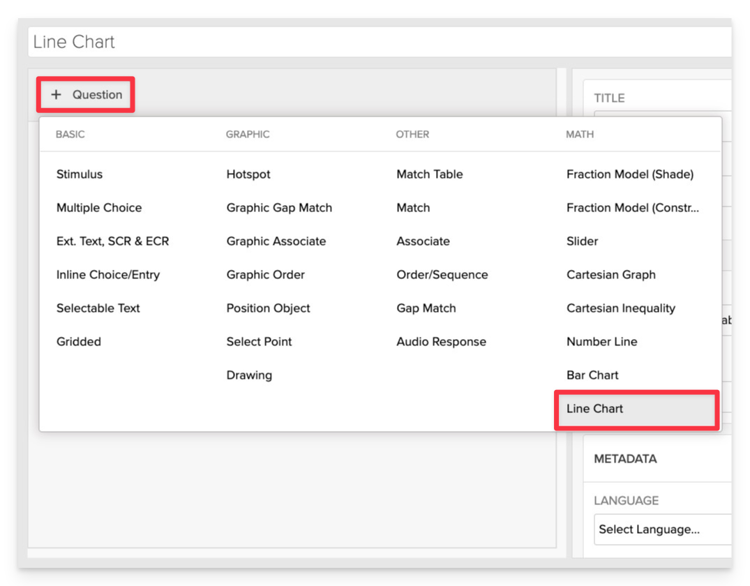
From the item editor, click on:
- Click on +Question.
- From the list of question types, select Line Chart.
Enter the Prompt
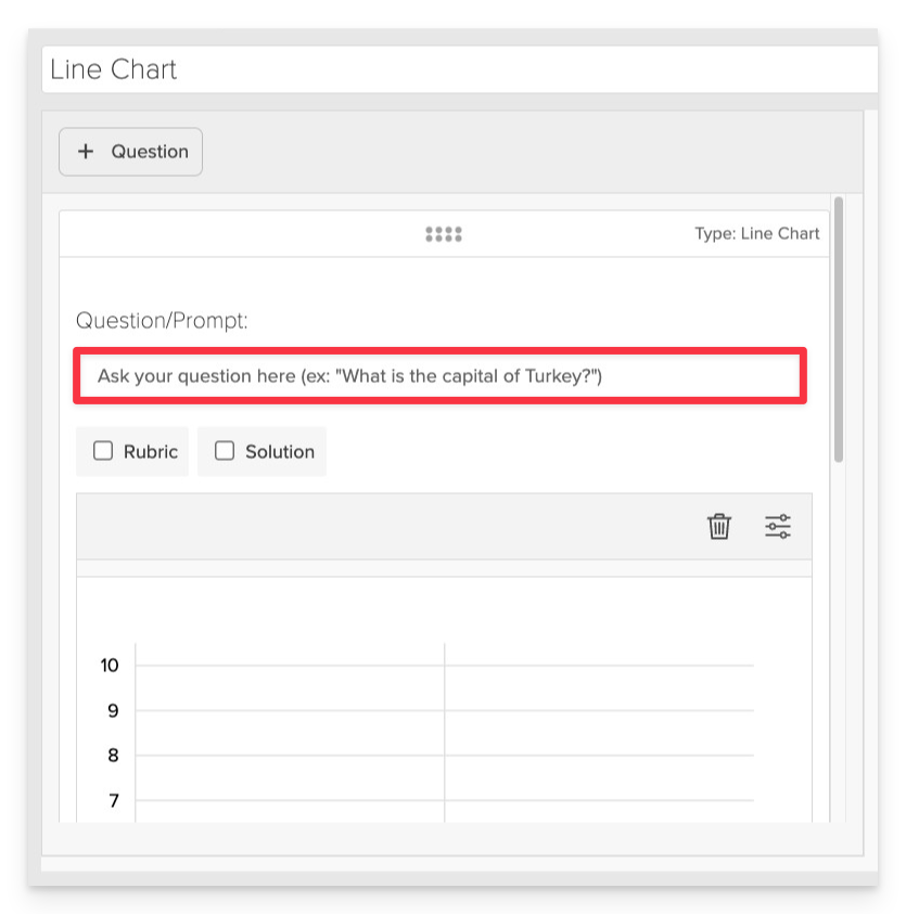
In the Prompt field, provide clear instructions for the student.
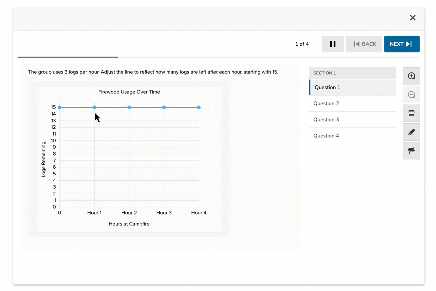
- Example: "The group uses 3 logs per hour. Adjust the line to reflect how many logs are left after each hour, starting with 15."
Configure Chart Settings
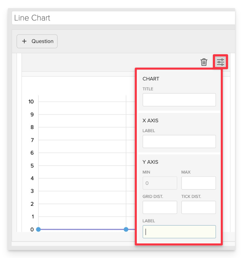
In the Graph Settings panel, define how the coordinate grid will appear and behave.
- Chart Title: Enter a descriptive title for the chart.
- X-Axis Label: Define what the horizontal axis represents.
- Y-Axis Label: Define what the vertical axis represents.
- Y-Axis Range: Set the minimum and maximum values for the Y-axis.
- Example: Min: 0, Max: 15
- Grid Distance: Determine the spacing between grid lines.
- Example: 1
- Tick Distance: Set the interval between tick marks on the axes.
- Example: 1
Define the Correct Answer
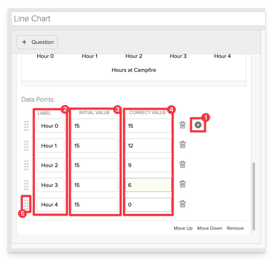
For each data point:
- Click +Add Data Point.
- Label: Assign a label to the point.
- Example: "0 hr"
- Initial Value: Set the starting value displayed to the student.
- Example: 15
- Correct Value: Enter the correct value the student should adjust the point to.
- Example: 18
- Should you need to make adjustments to the sequence, use the Drag Handles to reorder.
Repeat this process for each point you wish to include on the chart.
Always Preview your item. In the preview, click Reveal Key to confirm that all content—such as correct answers, placement, or visual elements—appears exactly as intended. This is the quickest and most reliable way to check your setup before saving.
Save the Item
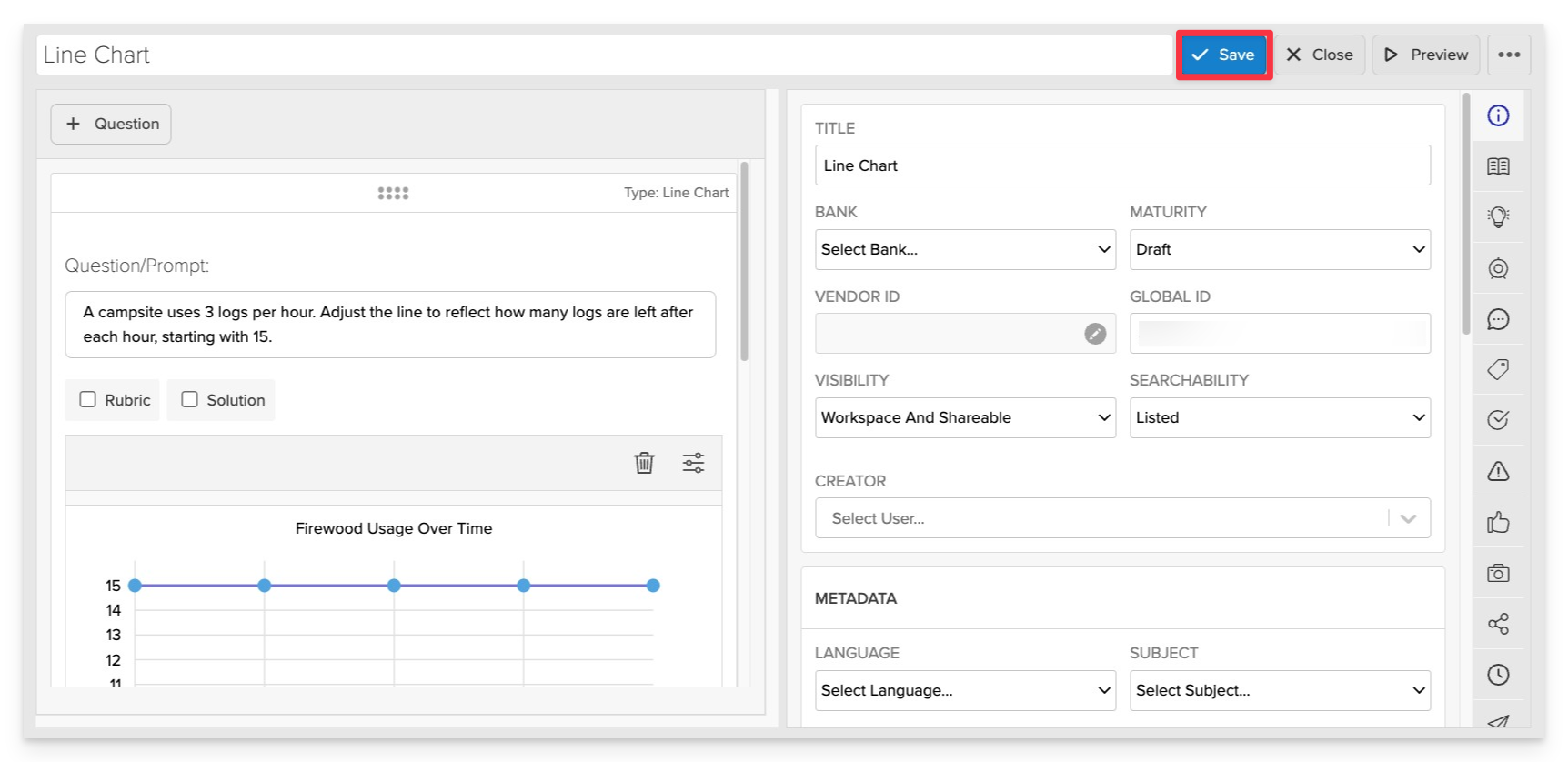
Click Save to store your item in Studio.