Bar Chart
The Bar Chart item type allows students to build a bar graph by adjusting the height of each bar based on a given data set. This interactive format is ideal for visualizing numerical information and supports tasks in both math and science, such as comparing quantities, interpreting trends, or constructing graphs from raw data.
Key Characteristics
- Students create bars by clicking at the zero line, dragging upward to the desired value, and releasing to set the height.
- Each bar is locked in place after release, allowing students to build the chart one bar at a time.
- The chart is customizable:
- Set the number of bars and labels.
- Define axis ranges and increments.
- Adjust graph styling and layout.
- Values can represent frequency, measurement, category totals, or other numeric data.
Instructional Connection
Bar Chart items are an effective way to reinforce data literacy and visual reasoning. By constructing the graph themselves, students engage actively with the underlying data, rather than simply interpreting a static chart. This format is especially useful for teaching concepts such as comparing values, identifying trends, or translating numerical data into visual form. Whether students are working with frequencies in a science lab or category totals in a math lesson, Bar Chart items support critical thinking, pattern recognition, and foundational graphing skills.
Authoring a Bar Chart Question
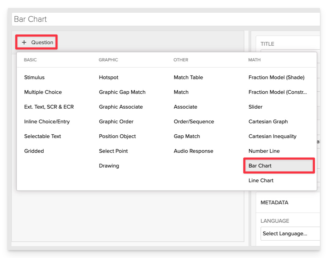
From the item editor:
- Click on +Question.
- From the list of question types, select Bar Chart.
Enter the Prompt
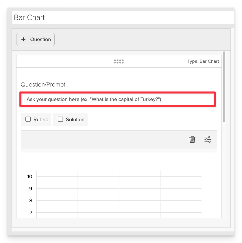
In the Prompt field, provide clear instructions for the student.
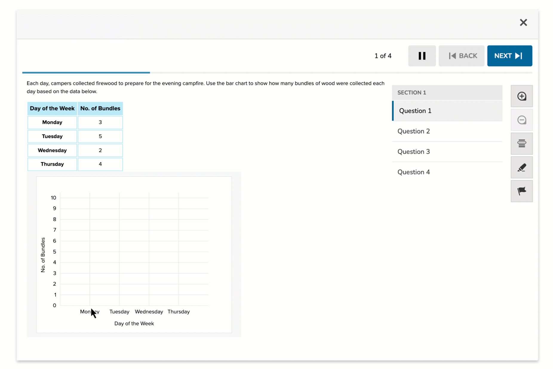
- Example: “Use the bar chart to represent the number of firewood bundles collected each day based on the data provided.”
Ensure the prompt clearly defines the task and provides any necessary context for the student to complete the activity.
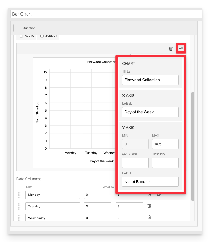
Configure the Graph Settings
In the Graph Settings panel, define how the bar chart will appear and behave.
- Chart Title: Enter a descriptive title for the chart.
- X-Axis Label: Specify the label for the horizontal axis (e.g., "Days of the Week").
- Y-Axis Label: Specify the label for the vertical axis (e.g., "Number of Bundles").
- Y-Axis Range:
- Minimum: Set the minimum value (e.g., 0).
- Maximum: Set the maximum value based on your data (e.g., 10).
- Grid and Tick Settings:
- Grid Distance: Define the spacing between grid lines.
- Tick Distance: Define the spacing between tick marks on the axis.
Add Data Points
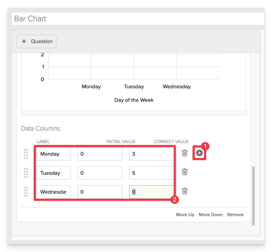
- Add Data Columns by clicking the plus button.
- Label: Name of the category (e.g., "Monday").
- Initial Value: The starting value displayed to the student (can be set to 0 or another value).
- Correct Value: The accurate value that represents the data (e.g., number of bundles collected).
Always Preview your item. In the preview, click Reveal Key to confirm that all content—such as correct answers, placement, or visual elements—appears exactly as intended. This is the quickest and most reliable way to check your setup before saving.
Save the Item
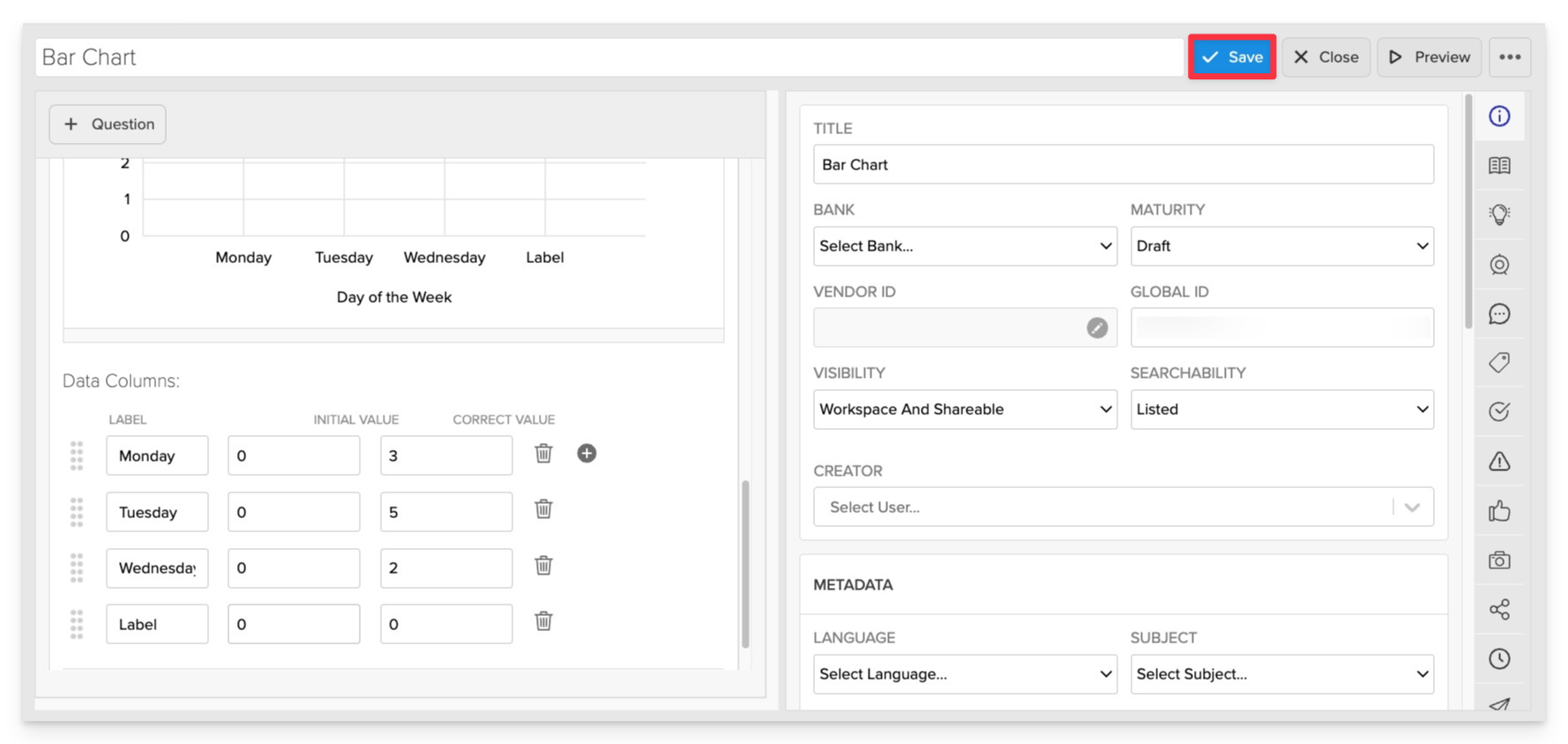
Click Save to store your item in Studio.